Creating an accurate and recognizable logo for your brand is one of the most important, and difficult, tasks for any business owner. Your logo is the face of your business – it needs to perfectly capture the essence of what your company is all about in just a few shapes and colors. This can be harder than it seems, and often takes more thought and effort than you might initially expect. But don’t worry, with a little bit of planning and creativity, you can create a logo that you and your customers will love.
In this blog, we will explore the steps you need to take to create a logo that will help boost your brand’s recognition. We’ll cover everything from the basics of designing a logo to tips on how to make sure it adequately represents your brand and increases brand awareness. So read on to get the insights you need to create an effective and appealing logo that accurately conveys your brand image!
Ready to Create a Logo That Represents Your Brand?

What is a Brand Logo and Why Is It Important?
A brand logo is a visual representation of your company and its values. It’s the symbol of your business identity, one that communicates your brand message to potential customers and conveys who you are in a single glance. A logo can be a powerful tool for engaging with your audience, and it’s essential for developing a strong and recognizable image that sets you apart from competitors.
Logos represent your business in any situation — from customer interactions to advertising campaigns, from print to digital applications — so it’s important to create one that is both tailored to your audience and versatile enough to work in multiple contexts. A successful logo should evoke emotions, attract attention and make an impression — all while reinforcing your brand identity and helping you build relationships with customers.
Creating a logo that encapsulates your brand and resonates with your target audience can take some thought, but the result can be highly rewarding. Having a logo that speaks to your customers will capture their attention and engage them with your brand, and ultimately help enhance your visibility and strengthen your reputation.
Elements of an Effective Logo
Crafting an effective logo is essential to making a brand visible and memorable.
Creating a logo for your brand can seem like a daunting task. After all, a logo is often the first impression of your company and needs to convey who you are and why someone should trust your business. It is important to understand that a logo is not just an image, but it’s a symbol of your brand identity. Therefore, it is important to take into consideration certain elements that create a logo that is effective.
The most important element of an effective logo is simplicity. A logo should be easy to recognize and remember. That means avoiding over-complicated designs and sticking to basic shapes and colors. Keeping your design simple and coherent will help the viewer easily recall your logo.
Next, you want to make sure your logo is relevant. It should reflect your brand and its values in some way. This is the stage where you would think about incorporating themes, colors, or icons that are associated with your company or industry. You may also want to consider using fonts that complement the overall look and feel of your logo.
Be sure that your logo is scalable and versatile. You need a logo that will look as good on a website as it does on a billboard. It should also be able to be resized without sacrificing the quality. For that reason, it is best to use vector graphics when creating a logo to ensure its scalability and clarity.
Finally, the most effective logos are timeless. Even if you decide to keep a recognizable brand logo down the road, you can update it to stay current. Design trends come and go, but if your logo stands the test of time, you’ll be sure to make.

Design Principles for Crafting Your Logo
Crafting a logo that truly represents your brand and enhances its visibility requires careful consideration of design principles.
Creating an effective logo for your brand can be a complex undertaking – after all, it has to capture the essence of your company and make it stand out from competition. In order to create a logo that is aesthetically pleasing and that truly communicates the heart of your brand, it’s important to understand the basics of design principles. Here’s how you can leverage theory and practice to craft a logo that will increase your brand’s visibility and appeal to your target audiences.
First, recognize that design requires careful balance. While logos should be visually arresting, they should also avoid being overly-complicated or difficult to parse. When you’re creating a logo, consider its visual weight – the amount of space a given element takes up. Achieving balance in a logo can be done by adjusting these visual weights, ensuring that the components of the logo are aligned with one another, and by incorporating elements of both symmetry and asymmetry.
It’s also important to consider the visual power of color. The colors that you incorporate into your logo can have a huge impact on how viewers interpret it. Colors have strong associations, both cultural and historical, and can even affect people’s emotions. When selecting colors for your logo, take into account the implications of any shades, hues, and tones you’re incorporating.
Finally, your logo should evoke an emotional response from its audience. Your logo should capture a feeling that’s linked to your brand, whether that’s relaxation, vibrancy, playfulness, or something else. Techniques like shape and color can help your logo to convey the right emotion.
Ultimately, your logo should inspire an emotional reaction from viewers; use form and hue to create an association with the desired sentiment connected to your brands, such as joyfulness, relaxation, or energy.

How to Choose the Right Colors
Choosing the right colors for your logo is essential for creating a logo that effectively represents your brand and helps to enhance its visibility.
When it comes to selecting colors for your logo design, the most important factor to consider is how they interact with each other. The colors you choose should be complementary and reflect the message of your brand. For example, if you are selling products that are earth-friendly, choose colors like green and brown. These colors will communicate an environmentally conscious brand to your viewers.
In addition, it’s important to balance the use of warm and cool colors in your logo. Generally, warm colors such as red, yellow, and orange will draw more attention, so use them sparingly. Cool colors like blue, green, and purple create a sense of tranquility and can help to bring balance to your logo.
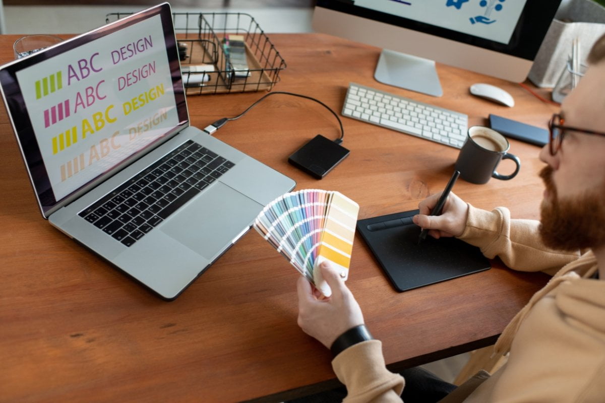
Finding a color scheme that best reflects your brand can take some time and experimentation. Consider using color-matching tools like Adobe Color to explore different combinations, or print out colors to test on paper – this will give you a better sense of how the colors look next to each other. Don’t forget to take into account how the colors will appear in different lighting. In some cases, you may even want to adjust your colors slightly to account for different display types and environments.
Finally, keep in mind that colors can have strong cultural associations. If you plan on selling your product or services in multiple countries, do research to find out how colors are perceived differently in different countries. By carefully choosing a color palette for your logo, you can create a cohesive design that effectively communicates your brand’s message and helps to enhance its visibility.
It’s All About the Font: How to Choose the Perfect Typeface for Your Logo
Creating a logo is about more than just slapping together a few graphics and a clever tagline. It’s about creating a unique visual representation of your company that will stick in customers’ minds and serve as a reminder of the quality products and services that you offer. And one of the most important elements of any logo design is selecting the right typography. After all, the font that you choose for your logo will say a lot about your business and its values.
When choosing which fonts to use in your logo design, consider the qualities that best represent your brand. Are you a modern, cutting-edge company who values innovation and forward thinking? Then try using a streamlined, minimalistic font style to reflect the modern minimalistic website design for your business. On the other hand, if you’re a classic, timeless company, then opt for a more traditional font style to echo the enduring appeal of your brand.
Remember, when it comes to choosing the right font for your logo, there’s no right or wrong answer. However, it’s important to take the time to select a typeface that accurately reflects the character of your business and resonates with your target market. Doing so will ensure that your logo has the maximum impact and helps you stand out from the competition.

Considerations for Logo Size and Placement
Having a logo that effectively represents your brand is essential for building a strong reputation and establishing a lasting presence in the marketplace. When it comes to creating a logo, size and placement can be just as important as the design itself. By taking the appropriate considerations into account, you can ensure your logo will reach its full potential by helping to make your brand more visible.
When crafting a logo, it is important to remember that size matters – larger logos are usually more visible and memorable than their smaller counterparts. Generally, logos should be designed to stand out on any page they appear on, while still being legible even when shrunk down to a small size. It’s also important to ensure the logo looks good in both high and low resolution, so that it still looks sharp and professional regardless of the medium it’s placed on.
Where your logo appears is also important. The most visually appealing logos are those which are placed prominently – for example, this might mean making it the focus of your website’s homepage or ensuring it appears at the top of your product packaging. Additionally, you should aim to place your logo on all of your marketing materials and in as many places as possible, such as social media, print ads, flyers, business cards and stationary.
By taking these considerations into account and ensuring your logo is properly sized and placed, you can create a logo that stands out, grabs people’s attention and effectively represents your brand – enhancing its visibility, boosting its recognition and ultimately leading to greater success.
Leveraging Varied Logo Variations for Enhanced Brand Visibility
Logos are invaluable visual components of any brand—they can encapsulate the essence of a company’s identity, serving as symbols of the values, ethos and mission they strive to achieve. It’s therefore essential to create a logo that is both impactful and distinctive, enabling customers to recognize the branding in a heartbeat. However, it’s just as important to create multiple versions of the logo to optimize its reach and to ensure your brand is being recognized across all mediums.
As such, creating multiple variations of a logo isn’t just about enhancing a brand’s visibility; it involves understanding how to best represent the company across different formats and mediums. Whether it be for social media platforms, print materials or web elements, tweaking the logo in various ways can enable it to remain consistent across all channels. From changing the color palette to adjusting the text format, there are several different iterations of the logo that can help a business stand out from the competition.
At the same time, it’s important to remember that logos are not only a form of identification; they also serve as symbols of trust and reliability. A logo should accurately reflect a brand’s core values and appeal to potential customers, distinguishing it from the crowd and providing them with a sense of familiarity. As a result, while making such variations, it’s important to keep the original logo intact, ensuring that it seamlessly ties into the wider brand identity of the product or service.
To sum up, having various renditions of the logo can help broaden a company’s presence. It is important to comprehend the various contexts the logo will be viewed in and revising it accordingly, all while keeping the logo’s original essence.

Get Professional Logo Design with Newman Web Solutions
Are you looking for the perfect logo to represent your business and make it stand out? If so, you need look no further than Newman Web Solutions. Our experienced team of Atlanta provides professional logo design services that enhance your brand’s visibility and help differentiate it from competitors.
At Newman Web Solutions Agency, we understand that a logo is more than just an image – it’s a visual summary of everything your company stands for. We craft unique logos that encompass your company values and mission, while still being attractive and eye-catching. From concept development to professional design and final tweaks, we provide a tailored service that meets all your requirements.
Our logo design process takes into account your company’s colors, fonts and tagline. We also keep an eye on current trends, while making sure the final logo reflects your individual brand identity. We are confident that our logos will capture the essence of your business and make a lasting impression on your customers.
Whether you’re starting a new business or rebranding an existing one, get a free strategy session to discuss your project today.


