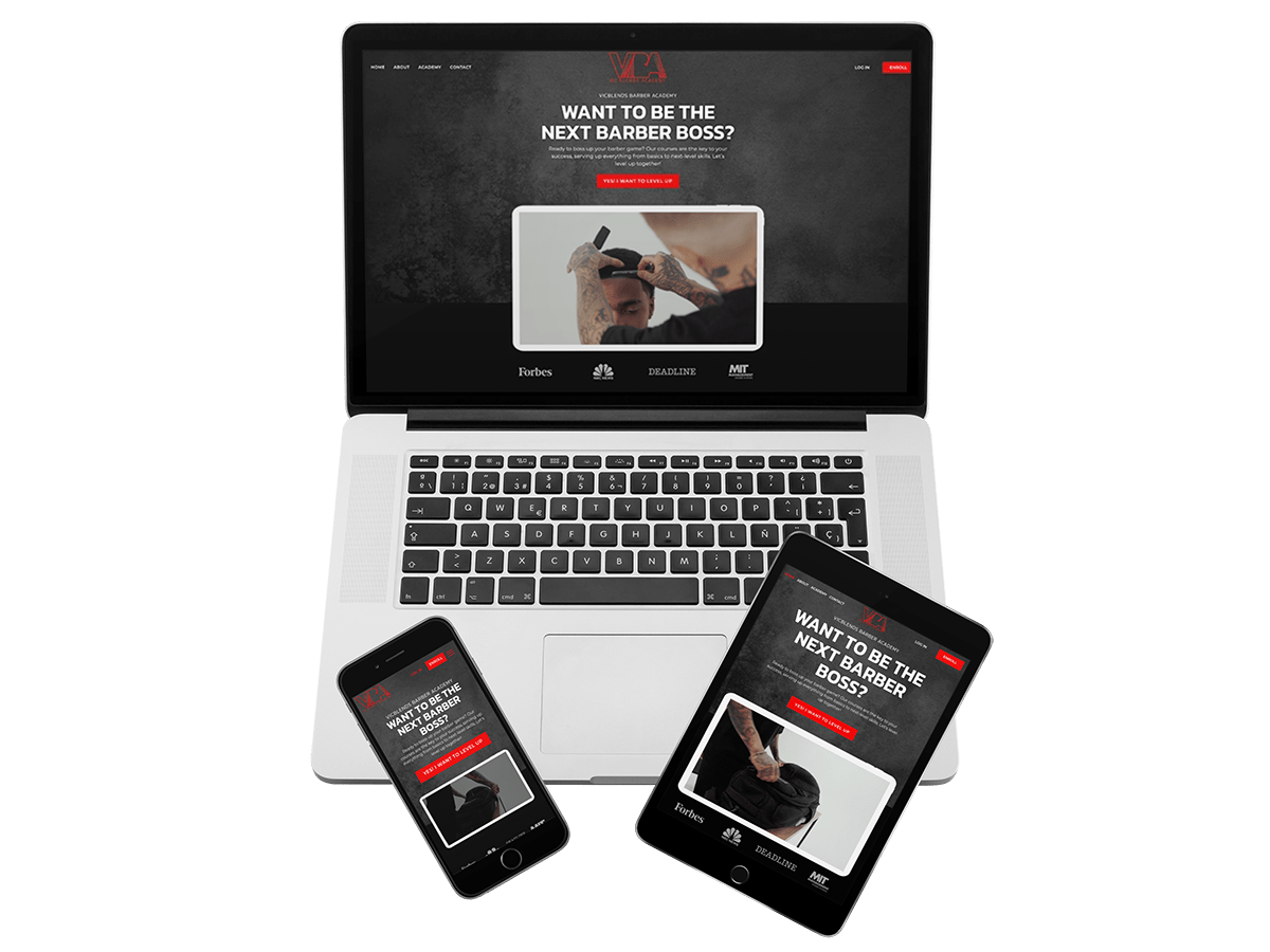
VicBlends Project Overview
The VicBlends Academy website redesign and development project aims to create an innovative online platform tailored to individuals interested in pursuing a career in barbering. This comprehensive project is estimated to span 8 weeks, encompassing extensive research, design, development, and testing phases.
New Website The Project
VicBlends Academy seeks to provide a cutting-edge learning management system by offering a wide range of courses, tutorials, and resources related to barbering. The project entails a complete website redesign, focusing on improving user experience, fostering greater engagement, and enhancing the overall learning process.
Project Duration
The project is expected to be completed in approximately 8 weeks, allowing ample time for in-depth research, meticulous design work, seamless development, and thorough testing.
The Problem
The VicBlends LMS Barber Academy website presents a number of significant challenges for its 60K+ students. Predominantly, the issues stem from an interface that lacks intuitiveness, limited interactivity, and obstacles when it comes to accessing the necessary course materials. Additionally, the process for seamlessly checking out and subscribing on a monthly basis proves to be difficult. As a result, these obstacles impede the website’s effectiveness as a valuable learning resource for both its users and owner.
The Goal
The primary objective of this case study is to revamp the VicBlends Academy website, ensuring a seamless, efficient, and enjoyable user experience. By addressing the identified problems, our aim is to elevate user engagement, satisfaction, and retention, ultimately cultivating a superior learning environment and seamless checkout.
Our Role
Our dedicated team comprises web developers and UX designers. Our role involves a multifaceted approach, including redesigning the user interface, optimizing navigation, reorganizing content for improved accessibility, and implementing technical enhancements to place user needs at the forefront.
Responsibility
As a web designer and UX specialist, our core responsibility is to lead the design efforts. This encompasses the creation of wireframes, prototypes, and the final design, all while adhering to a user-centric approach. Collaboration with developers is pivotal to ensure the seamless realization of our design vision.
Understanding of the User
User Research
To gain invaluable insights into the needs and behaviors of website visitors, we will undertake extensive user research. Our UX metrics will encompass:
- Evaluating Website Performance: Examining the User Experience.
- Analytics: To analyze user behavior, traffic patterns, and conversion rates.
- Facilitating user communication: Enabling comprehensive dialogues with the owner to gain a deeper understanding of their unique challenges and expectations.
Summary
Based on the initial findings of the user research, it has been identified that users are facing obstacles while navigating the course, accessing relevant course materials, and completing the monthly recurring subscription checkout process. These difficulties not only undermine the overall quality of the learning experience but also impact the owners’ recurring revenue.
Pain Point
The primary pain point users face is the arduous task of finding and accessing valuable course content. Additionally, the lack of interactivity and community engagement opportunities curtails users’ ability to connect with peers and mentors effectively, diminishing the platform’s potential for learning and growth.
Personas
To better understand our target audience, we have crafted a user persona, “Aspiring Barber Ben.” Ben is a young individual passionate about pursuing a career in barbering. He is actively seeking a user-friendly platform that grants access to high-quality learning materials and facilitates interaction with a supportive community.
Problem Statements and User Journey Map
Problem Statement: Users grapple with locating and accessing relevant course information, which results in frustration and reduced engagement.
User Journey Map
- User lands on the website.
- User endeavors to explore available courses.
- User encounters difficulties in finding desired course content.
- User may opt to leave the site due to mounting frustration.
UX Structure
To address these issues effectively, our strategy entails redesigning the website’s information architecture, introducing an intuitive navigation menu, incorporating interactive community features, and reorganizing learning resources for effortless access.
The Impact and Lessons Learned – VicBlends Academy
By the culmination of this project, we anticipate witnessing a notable enhancement in user engagement and satisfaction. We envision reduced bounce rates, increased dwell time on the platform, and the increased subscriptions of aspiring barbers. This case study underscores the paramount importance of continuous user research, responsive design, and user-centric development in the creation of thriving e-learning platforms that cater adeptly to diverse user needs.


