Campbell Tree Services Website Design Project Overview
The Product
Campbell Tree Services, a premier tree care company based in Acworth, Georgia, sought to establish its digital presence by launching a brand-new website. The absence of an online platform meant that potential customers had difficulty discovering their services, understanding the breadth of their offerings, and getting in touch. The project aimed to craft a user-centric website that not only showcases Campbell Tree Services’ expertise and services but also facilitates an easy way for users to request quotes, understand the process, and engage with the company.
Project Duration
The project was ambitiously set to be completed within a 2-month timeframe. This period was dedicated to thorough research, design, development, and testing phases to ensure a high-quality outcome.
The Problem
The core problem was the lack of an online presence for Campbell Tree Services, which limited their reach and accessibility to potential customers. In a digital age, the absence of a website meant missed opportunities for business growth, customer engagement, and service education.
The Goal
The primary goal was to create an intuitive, informative, and accessible online platform that would serve as a comprehensive resource for both existing and potential customers. The website aims to increase visibility, streamline the service inquiry process, and enhance customer engagement through a user-friendly experience.
Our Role
As the web designers on this project, our role encompassed understanding user needs, conceptualizing the user experience, designing the interface, and overseeing the website design process to ensure the final product was both functional and aesthetically pleasing.
Responsibility
Our responsibilities included conducting user research, creating wireframes and prototypes, testing designs for usability, and working closely with UI designers and developers to bring the vision for the website to life. Throughout the project, we prioritized aligning the website’s design with the company’s branding and new logo, while meeting user needs.

Understanding the User
User Research
To understand the target audience, we employed a variety of UX research methods, including a website design brief and competitor analysis. Key metrics focused on were usability, accessibility, engagement, and satisfaction. This comprehensive approach allowed us to gather insights into user behavior, preferences, and pain points.
Summary
Our research revealed that users sought a straightforward, informative, and reliable online resource that could help them make informed decisions about tree services. They valued ease of navigation, clear descriptions of services, and the ability to easily contact the company for quotes or further information.
Pain Point
A significant pain point identified was the difficulty in understanding the scope of services offered and the process involved in tree care services, which made users hesitant to initiate contact or request a service.
Personas
We have developed a user persona named “Homeowner Helen.” Helen is a 45-year-old homeowner whose property is overgrown with old trees, and she lacks the ability to remove them. She is looking for a reliable service provider who can assist her in the process, provide clear information, and safely remove the trees from her property with ease.

Problem Statements and User Journey
Problem Statements
- Discovery and Awareness: Homeowner Helen, frustrated with the overgrown trees on her property, begins her search for a reliable tree service provider. She seeks a company that is knowledgeable and offers clear, accessible information on their services and process.
- Consideration and Decision Making: After finding Campbell Tree Services’ website, Helen is impressed by the detailed descriptions of their services and the straightforward information about tree removal procedures. She appreciates the ease of navigating the website and the availability of customer support, which helps her feel confident in her decision to consider them for her tree removal needs.
- Action and Satisfaction: Encouraged by the information and support provided, Helen decides to request a service from Campbell Tree Services. The process is simple and efficient, leading to the safe and hassle-free removal of the old trees from her property. Satisfied with the outcome, Helen feels relieved and grateful for the professional and reliable service she received, considering Campbell Tree Services for future needs and recommending them to friends.
User Journey Map
We developed a detailed user journey map highlighting Helen’s path from discovering Campbell Tree Services online to successfully booking a service. This map included key touchpoints such as service discovery, learning about services, decision-making, contacting the company, and post-service follow-up, allowing us to identify opportunities to enhance the user experience at each stage.
UX Structure
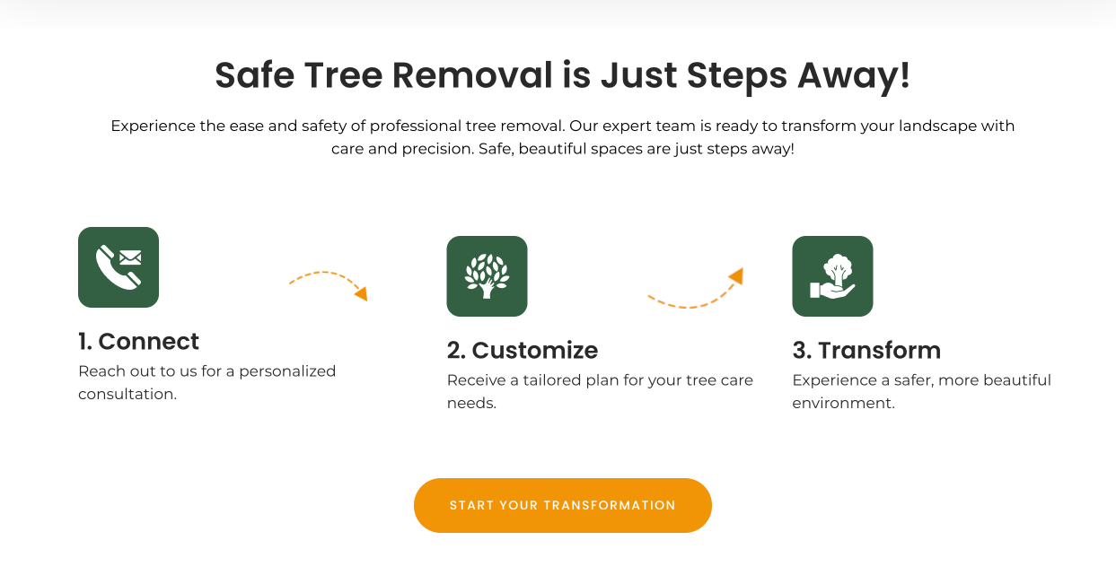
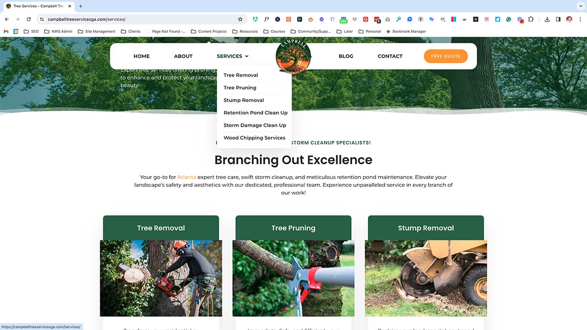
The website structure was designed to be intuitive, with a clear hierarchy that guides users through information discovery to action. The navigation was simplified to ensure users could easily find what they were looking for, with dedicated sections for tree services, about us, FAQs, and contact information. Interactive elements, such as a service request form and a chatbot for immediate queries, were incorporated to improve user engagement and satisfaction.
Impact and Learnings
The launch of the Campbell Tree Services website significantly increased the company’s visibility and accessibility, leading to a notable uptick in service inquiries and customer engagement. The website has been praised for its user-friendly design, informative content, and easy navigation, fulfilling the project’s goals and addressing the identified pain points.
What We Learned
This project reinforced the importance of thorough user research and testing in creating a successful UX design. It highlighted the value of understanding the user’s journey from start to finish and ensuring the design addresses their needs and pain points. Collaboration across teams was crucial in bringing the design to life and ensuring the website not only looked good but also functioned seamlessly.


