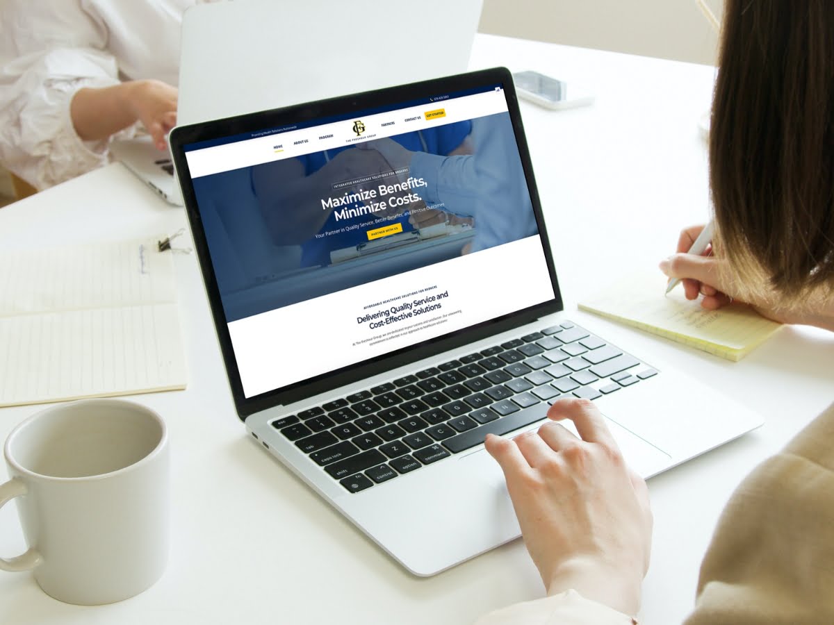
The Freshour Group, an emerging leader in healthcare solutions, sought to establish their digital presence with a brand-new website. Their vision was to create an online platform that not only showcases their services but also embodies their commitment to transforming healthcare experiences. Our task was to build a website from the ground up, ensuring it reflects the group’s expertise, values, and innovative approach to healthcare.
The Problem
The Freshour Group lacked an online presence, which limited their ability to reach and engage with their target audience effectively. The absence of a digital platform made it challenging for potential clients to discover their innovative healthcare solutions and understand their unique approach to transforming health experiences.
The Goal
Our primary goal was to design and develop a website that serves as a digital gateway to The Freshour Group’s services and values. The website needed to be intuitive, informative, and reflective of the group’s commitment to redefining the path to better health.
Our Role
As the team at Newman Web Solutions, we embraced the roles of Web Developers and UX Designers. Our responsibility was to create a website that aligns with the client’s vision and effectively communicates their message to the target audience.
Responsibility
Our responsibilities encompassed the entire process of website creation, from initial concept and design to development and deployment. This included user research, content creation, interface design, coding, testing, and optimization for the best user experience.
Understanding the User
User Research
We conducted extensive research to understand the needs and preferences of The Freshour Group’s potential website visitors. This involved analyzing market trends, studying competitor websites, and gathering user feedback through surveys and interviews.
Summary
Our research revealed that users sought a healthcare website that was easy to navigate, provided clear and concise information, and offered a sense of trust and credibility in the healthcare domain.
Pain Point
The primary pain point identified was the lack of accessible, straightforward information about innovative healthcare solutions in a single, user-friendly platform.
Problem Statements and User Journey
User Journey Map
We developed a comprehensive user journey map to visualize the path a visitor would take from landing on the website to engaging with The Freshour Group’s services.
UX Structure
The UX structure was designed to be intuitive and user-friendly, with a clear hierarchy of information, responsive design, and interactive elements to engage users effectively.
The Impact and Learnings
The launch of The Freshour Group’s website marked a significant milestone in their digital journey. It resulted in increased visibility, user engagement, and a platform that truly represents their vision of transforming healthcare experiences.
This project taught us the importance of aligning a website’s design and functionality with the client’s core values and the needs of their target audience. Our experience with The Freshour Group reinforced our belief in the power of digital solutions to not only convey a message but also to connect and inspire.


