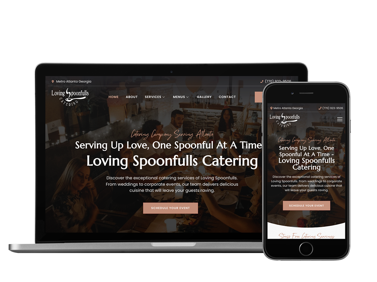
Loving Spoonfulls Catering UX Website Redesign
Project Overview:
The Loving Spoonfulls Catering of Norcross GA Website Redesign project aims to enhance the user experience and improve the overall functionality and visual appeal of the company’s website. As UX designers, our responsibility is to understand the needs and goals of the users, conduct thorough research, and create design solutions that are intuitive, efficient, and enjoyable to use. By revamping the website, we strive to provide a seamless and delightful online experience for potential clients, leading to increased engagement and business growth.
The Product:
The product is the Loving Spoonfulls Catering website, which serves as the online platform for showcasing the company’s catering services, menus, event planning options, and contact information. The website aims to attract potential clients, provide them with essential information, and ultimately encourage them to book catering services for their events. The redesign will focus on improving the website’s usability, visual appeal, and accessibility across various devices.
Project Duration:
The estimated project duration for the Loving Spoonfulls Catering website redesign is 6 weeks.
The Problem:
The core problem identified with the current website is its outdated design and poor user experience. Users encounter difficulties in finding relevant information, navigating through the site, and understanding the available services. The website lacks a cohesive structure, making it challenging for users to engage with the content effectively. Additionally, the website does not adapt well to different screen sizes, resulting in a subpar experience for mobile and tablet users.
The Goal:
The goal of this case study is to redesign the Loving Spoonfulls Catering website to address the user experience issues and provide an intuitive, visually appealing, and responsive website that caters to the needs of potential clients. By achieving this, we aim to improve user engagement, increase conversions, and ultimately contribute to the growth of the business.
Our Role:
As UX Web Designers, our role in this project is to lead the research, analysis, and design phases of the website redesign. We will collaborate closely with stakeholders, including the client and development team, to understand their requirements, gather feedback, and translate it into actionable design solutions. Additionally, we will ensure the implementation of best UX practices and usability principles throughout the project.
Responsibility:
Our responsibilities include:
- Conducting user research and analysis to understand user needs, preferences, and pain points.
- Creating user personas to represent the target audience.
- Defining problem statements and mapping out user journeys and UX structures.
- Designing intuitive and visually appealing user interfaces.
- Collaborating with the development team to ensure the implementation of the designs.
- Testing and iterating on the design solutions based on user feedback and usability testing results.
Understanding the User:
User Research: To gain a deep understanding of the users and their needs, the following UX research methods will be employed:
- Competitive Analysis: Evaluating competitor websites to identify industry standards, best practices, and potential areas for improvement.
- Analytics Review: Analyzing website analytics to gather data on user behavior, popular pages, and bounce rates.
Summary:
Based on the research conducted, it is evident that users expect a seamless and intuitive experience when interacting with the Loving Spoonfulls Catering website. They desire easy access to information such as menus, pricing, and contact details. They also value a visually appealing design that conveys professionalism and expertise. However, the current website fails to meet these expectations, resulting in frustration and a negative perception of the brand.
Pain Point:
The main pain point that users are facing is the difficulty in finding relevant information and navigating the website. The current design and structure of the website make it challenging for users to locate essential details about catering services, menus, pricing, and contact information. This lack of clarity and ease of use hinders users’ ability to make informed decisions and take action.
Personas:
Two user personas have been created based on the user research:
- Persona Name: Sarah Event Planner
- Background: Sarah is an event planner working for a corporate events company. She frequently organizes conferences, seminars, and business meetings.
- Goals: Sarah wants to find a reliable and professional catering service for her upcoming corporate event. She needs detailed information about catering options, menus, pricing, and contact details.
- Pain Points: Sarah struggles to navigate the current website and locate the necessary information quickly. The lack of clear pricing details and a comprehensive menu make it difficult for her to make informed decisions.
- Persona Name: Mark Party Organizer
- Background: Mark is a party organizer who specializes in planning weddings, birthday parties, and other social events.
- Goals: Mark is searching for a catering service that offers a diverse menu, customizable options, and a smooth booking process. He wants to find inspiration and ideas for menu selection and get in touch with the catering team easily.
- Pain Points: Mark finds it challenging to navigate the website on his mobile device while on the go. The lack of visually appealing imagery and poor presentation of menu options make it difficult for him to visualize the catering offerings.
Problem Statements and User Journey:
Problem Statement: Users struggle to find relevant information and navigate the website easily, resulting in low engagement and conversion rates.
User Journey:
- Sarah, the event planner, visits the Loving Spoonfulls Catering website to explore catering options for her upcoming corporate event.
- She encounters difficulties in locating menus and pricing details, leading to frustration and wasted time.
- Sarah navigates through various pages, but the lack of a clear structure makes it challenging for her to find the necessary information quickly.
- Frustrated, Sarah decides to explore other catering options and leaves the website without making a booking.
Problem Statement: The lack of responsiveness and poor mobile experience hinders users’ ability to access information and make informed decisions.
User Journey:
- Mark, the party organizer, visits the Loving Spoonfulls Catering website on his mobile device while researching catering options for an upcoming wedding.
- The website does not adapt well to his device, leading to a clunky and unappealing experience.
- Mark struggles to view menu options and navigate through the website, resulting in frustration and a negative impression of the company.
- Disappointed, Mark looks for alternative catering services that offer a better mobile experience.
UX Structure:
The UX structure of the redesigned Loving Spoonfulls Catering website will include:
- Clear and intuitive navigation menu to facilitate easy access to different sections of the website.
- Well-organized content hierarchy, ensuring important information such as menus, pricing, and contact details are prominently displayed.
- Responsive design that adapts seamlessly to different screen sizes, providing an optimal experience for users on desktop, mobile, and tablet devices.
- Visual enhancements, including high-quality imagery, appealing color schemes, and consistent branding elements, to create an engaging and professional visual presence.
The Impact and Lessons Learned:
The impact of the Loving Spoonfulls Catering website redesign is expected to be significant. By addressing the core problems and improving the user experience, the website will witness increased user engagement, higher conversion rates, and improved customer satisfaction. The seamless navigation, accessible information, and visually appealing design will attract and retain users, leading to increased bookings and business growth.
Throughout this project, we learned the importance of conducting thorough user research to understand their needs and pain points. The creation of user personas helped in empathizing with the target audience and designing solutions that cater to their specific requirements.
Furthermore, focusing on responsive design and mobile user experience highlighted the significance of adapting to the growing mobile user base. By implementing these insights and learnings, we believe the Loving Spoonfulls Catering website redesign will greatly enhance the user experience and drive positive outcomes for the business.
Are you in the catering industry and looking to revamp your website or enhance your marketing strategy? Explore our portfolio of catering website design and marketing projects to get inspired.
Next Steps for Loving Spoonfulls Catering
To elevate Loving Spoonfuls Catering to new heights, leveraging a catering business CRM is essential. This powerful tool can streamline operations, enhance customer relationships, and boost overall efficiency. By integrating a catering CRM into their business model, Loving Spoonfuls can effectively manage bookings, track customer preferences, and analyze performance data to make informed decisions. With the right CRM system in place, Loving Spoonfuls Catering can optimize its processes, increase customer satisfaction, and ultimately drive business growth.
