Comprehensive Website Redesign for Restor-It Flooring
Project Overview
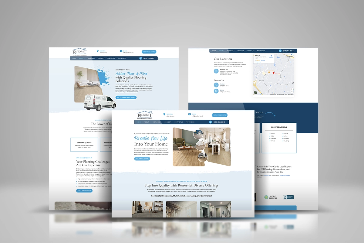
The project entails a comprehensive redesign of the website for Restor-It Flooring & Restoration, a company based in Marietta that serves the Metro Atlanta and surrounding areas. The aim is to enhance the user experience by addressing current usability issues and incorporating modern design principles.
This case study outlines the process undertaken to achieve a more intuitive, efficient, and enjoyable online presence for Restor-It. The project focuses on improving navigation, accessibility, and overall aesthetic appeal to attract and retain customers, ultimately boosting conversions and customer satisfaction.
Through detailed user research, analysis of behavior and feedback, and iterative design solutions, the project strives to create a seamless online journey for potential and existing customers seeking flooring and restoration services.
The Product
Restor-It Flooring & Restoration offers a wide range of services, including carpet replacement, hardwood floor installation, water damage restoration, and more. The product in this context is the company’s website, which serves as the primary touchpoint for customers to learn about services, view past projects, request quotes, and get in touch with the team.
Project Duration
The project is estimated to take approximately 2 months to complete.
The Problem
Users were encountering several issues on the existing website, including difficult navigation, outdated design, lack of mobile optimization, and poor accessibility. These problems resulted in a high bounce rate and low engagement, making it challenging for potential customers to find the information they needed and get in touch with the company.
The Goal
The goal of this case study is to create a redesigned website that enhances user experience, improves accessibility, and increases engagement and conversion rates. By addressing the core issues, the new website aims to provide a seamless and enjoyable experience for users, making it easier for them to explore services, view projects, and contact Restor-It for their flooring and restoration needs.
Our Role
As UX Designers, our role in this project was to lead the redesign efforts, conducting user research, analyzing feedback, creating design solutions, and ensuring the final product aligns with user needs and business goals.
Responsibilities
- Conducting user research and analyzing behavior and feedback
- Creating wireframes, prototypes, and design solutions
- Collaborating with developers and stakeholders
- Conducting usability testing and iterating on designs
- Ensuring the final product meets accessibility standards
Understanding the User
User Research
To understand the needs and behaviors of Restor-It’s customers, I utilized the following UX metrics:
- Interviews
- Usability testing
Summary
The user research revealed that customers primarily visit the website to explore services, view past projects, and request quotes. They value a clear, easy-to-navigate site with a modern design and responsive features.
Pain Points
- Difficult navigation
- Outdated and unappealing design
- Lack of page content
- Poor accessibility features
Personas
Persona 1: Homeowner Hannah
- Age: 35
- Occupation: Teacher
- Goals: Find reliable flooring services, view past projects, request quotes
- Pain Points: Struggles with navigating the website, finds the design outdated, and has difficulty finding information on products and services
Persona 2: Contractor Carl
- Age: 45
- Occupation: Independent Contractor
- Goals: Partner with a reliable restoration company, review service details, contact for collaboration
- Pain Points: Information is hard to find, website, lacks detailed service descriptions
Problem Statements and Details
The primary problem statements identified include:
- Users cannot easily navigate the website to find the information they need.
- The outdated design fails to engage users and build trust.
- The lack of content frustrates users.
User Journey Map
A detailed user journey map was created to visualize the steps users take from landing on the homepage to contacting Restor-It. The map highlighted key touchpoints, user actions, emotions, and potential pain points, guiding the redesign process.
The Impact
The redesigned website will decrease in bounce rates and an increase in user engagement and conversion rates. The modern design, improved navigation, and mobile optimization led to a more enjoyable user experience, making it easier for customers to find information and contact Restor-It for their services.
What We Learned
Through this project, we learned the importance of user-centered design and the impact of thorough user research. Iterative testing and feedback are crucial in creating a product that truly meets user needs and enhances their overall experience.
